
UX Design boosts website performance. Here's how you can do it in four easy steps
UX stands for User Experience. It is a key element to take into account when designing your law firm's website, as it focuses on delivering the best possible value to potential clients while boosting your business objectives.
At Elastic Heads, we know User Experience Design (UX) is vital to ensure optimal results for the webpage of any business. Law firms are no exception.
Here are four tips you can apply right now to boost your webpage's performance, get more leads and enhance your clients' experience.
1. Make Your First Impression Count
You know what they say... You only get one chance to make your first impression.
When you first go to a legal website, you often are presented with an obnoxiously large stock photo and a piece of text that doesn't really capture the value proposition.
As practitioners of Law, there is a temptation to use jargon that can often put off inexperienced prospective clients. Users need to understand exactly how you can help them.
We can address this issue simply, but effectively, by putting extra work on the Hero Banner (the first big module) to consolidate a direct connection with the user.
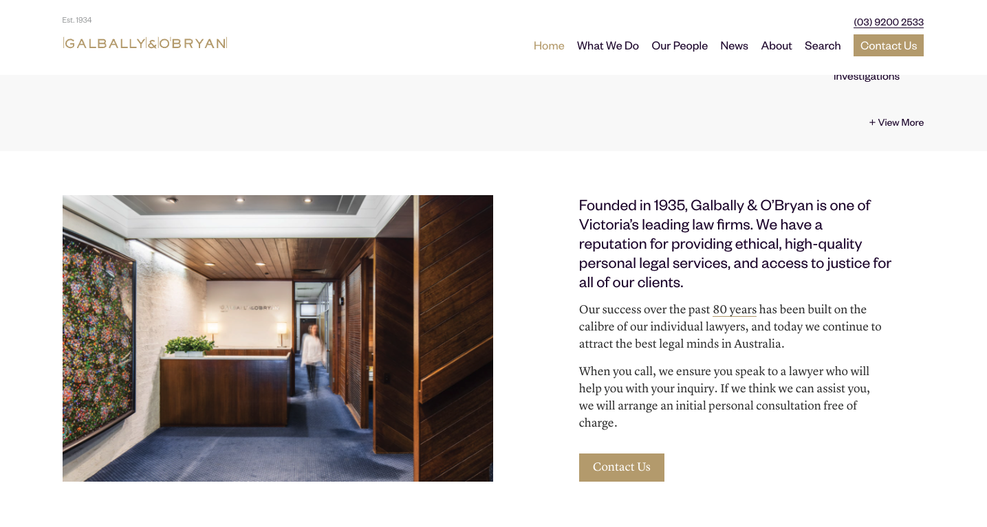
Images
The ideal solution is to rely on a professional and have custom images taken of your real team members and offices, but this is not always an option as photoshoots can be expensive and tend to quickly become outdated.
Keep in mind that a badly chosen stock image is at best a missed opportunity for communication and differentiation, but at worst it can be a critical symptom of neglect and sloppiness.
When choosing stock photos, make sure of the following:
- You haven't seen it elsewhere. Try to go for photos your direct competition hasn't already used, and that they are not too similar.
- It has good quality. Even if a photo is perfect for your website and message, low definition or pixelated images give users a feeling of unprofessionalism.
- It supports the message you need to get across. This is the trickiest part... Make sure the image isn't too generic; like pens and paper or handshakes. Work on your value proposition and then intentionally choose a photo that enhances it.
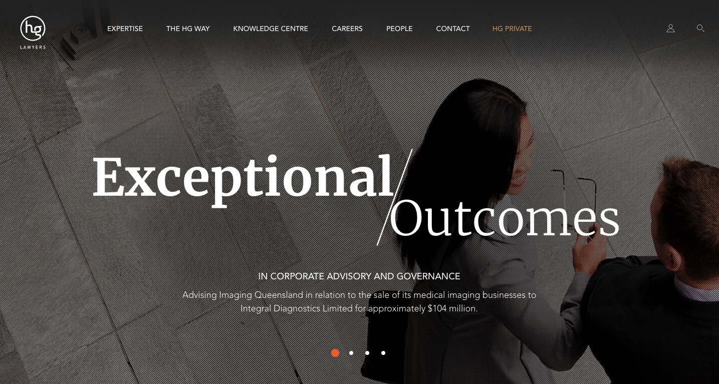
Source: https://www.galballyobryan.com.au/
Value Proposition
Your value proposition should be the main focus of the Hero Banner. It should clearly and assertively showcase the advantage of hiring your business. This may be your long-standing reputation, your expertise in one specific area, your warm and friendly approach, or whatever makes the decision of hiring you easier for your type of client.
Let's look at some great examples:
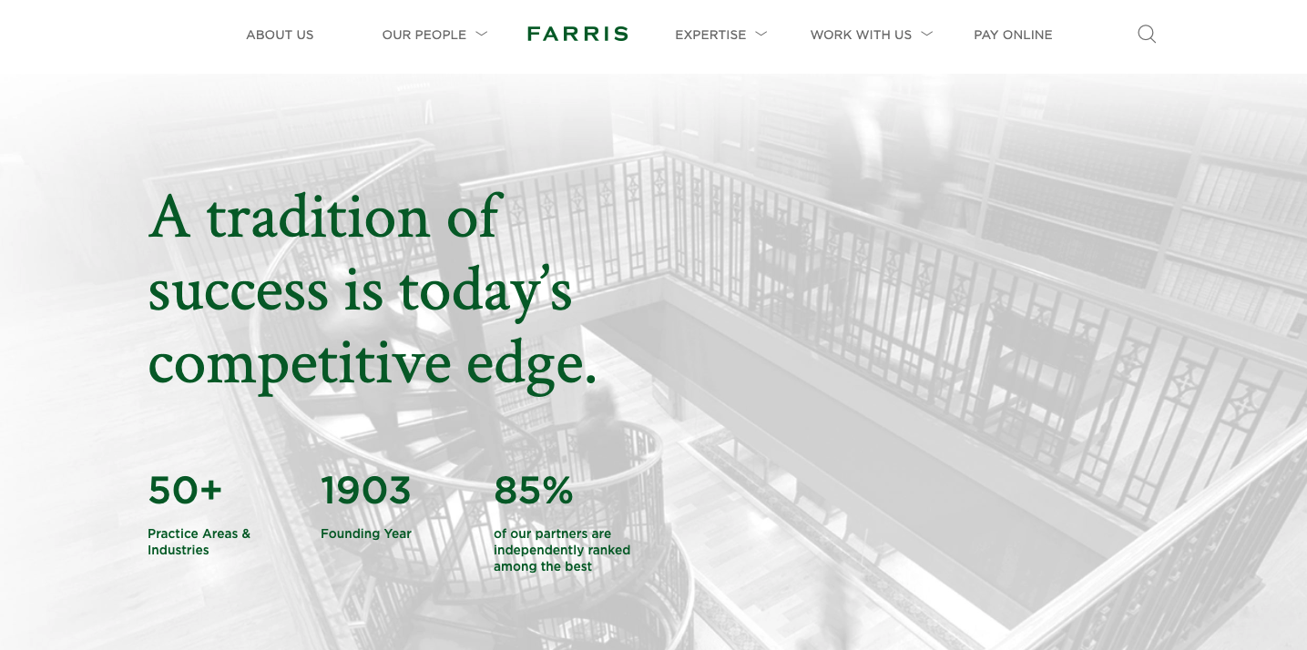
Source: https://farris.com/
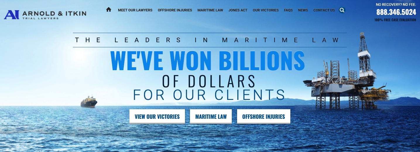 Source: https://www.offshoreinjuryfirm.com/
Whatever your value proposition is, it always helps to focus on one idea only. It must be clear, short and easy to understand.
We don't recommend using the Hero Banner for recent news or other changing content.
This first module is your ID card, your billboard, and your only chance at that lasting first impression.
2. Keep It Simple
The key to great UX for your website is to make sure it has been thought out to **fulfill its users' needs** while remaining **understandable and simple to use**. That's easier said than done!
Here are some tips you can apply today:
- Steer away from jargon, overly complicated text, and long paragraphs.
Of course, this depends on your public but it's always good to be understandable by everyone; regardless of their expertise.
 Source: https://www.hopgoodganim.com.au/
Source: https://www.hopgoodganim.com.au/
- Avoid placing text directly over images.
Although it can occasionally look good it's almost certain to negatively affect readability. A strong value proposition is diluted and loses impact when it can't be read easily. When in doubt, go with a solid background.
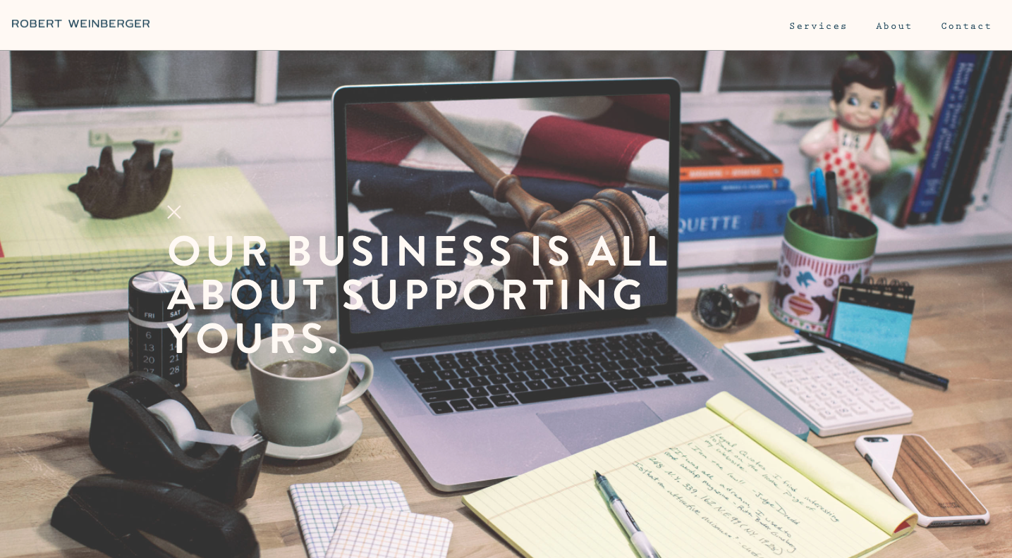
Source: http://www.rkweinbergerlaw.com/
- Remove distractions.
User's attention is a scarce resource. Treat it as such and keep in mind that by trying to showcase too much, you might end up not showcasing anything!
Take the example below. When visiting this website users can feel overwhelmed by the amount of information fighting for their attention: A live chat with a notification, floating open chat, google rating... It's just too much to take in.
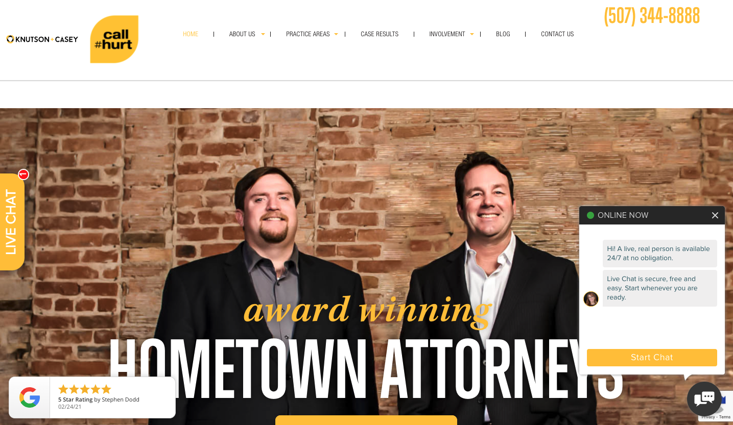
Source: https://knutsoncasey.com/
- Gradually disclose complicated content.
As law practitioners, it's inevitable to be addressing complex topics. We can make things simpler by keeping that complexity inside of subpages. Keep extra details easy to access through the use of clear titles or menu items.
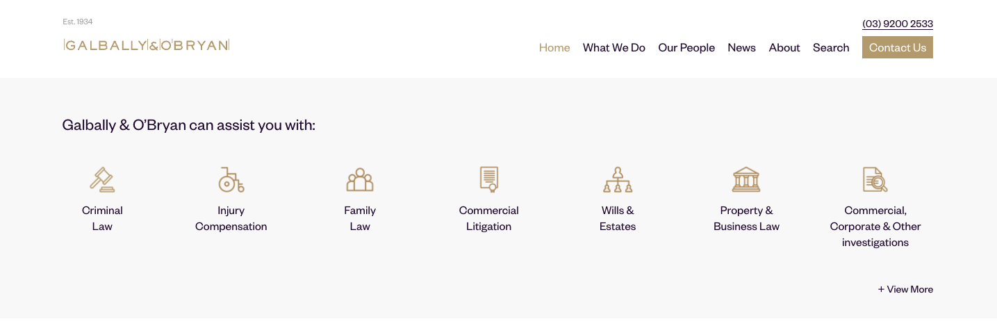
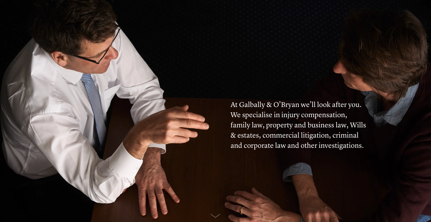
Source: https://www.galballyobryan.com.au/
3. Avoid Dead-Ends
Make sure a contact form or button is always available – but not overpowering– to get more information or hire your services. This way, your users will never be stuck at a dead-end.
Here's a good example... Notice that nudge at the bottom right? This accompanies you through your browsing and you'll always know where it is there in case you need it. It won't bother you with notifications or by opening up unprompted.
Another option is to include a contact button in your menu bar. You can also add this type of button next to your content throughout the website, wherever it makes sense.
It's all about making it easy to contact you, but not seeming pushy.
4. Empathize with your users
Throughout the process of building your website be sure to keep in mind **who your customer is, what they need and exactly how you can help them.** This will in turn optimize the language you use, the images you choose and the complexity of the homepage content.
A true representation of people's needs in your website can make your firm unforgettable and create an invaluable bond with your potential customers. Take this, for example:
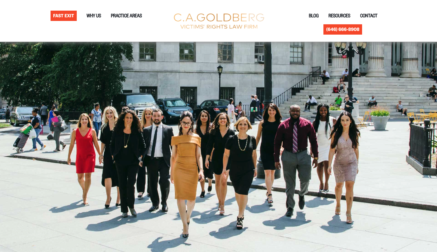
Source: https://www.cagoldberglaw.com/
By adding a "fast exit" button, this firm allows scared victims to feel safe when looking for help, even if a potential threat is nearby. They succeed at making their users feel understood and taken care of while making their firm a safe space.
Although this feature might not be a good fit for your specific area of expertise, going the extra mile with empathy is guaranteed to enhance your website's user experience and performance.
Remember...
At Elastic Heads we are experts in creating memorable, fulfilling, and successful digital experiences. If you want to harness the power of UX Design for your business contact us here.
Would you like to read more?
The Impact Lawyers offers a FREE newsletter that keeps you up to date on news and analysis about the international latest legal news.
Please complete the form below and click on subscribe to receive The Impact Lawyers Newsletter subscription
Related links
Main menu